What are your Business Goals and How It Helps the Community?
My name is Alex Kolokolov and I’ve been creating dashboards for over 15 years. After all these years, it stays a passion of mine, because with each project, I find a new angle to evolve professionally. I’m the founder of Data2Speak Inc., the company which is dedicated to providing business intelligence services and training.
I also contribute to the broader data visualization community by organizing the DataViz conference and founding the “Make Your Data Speak” award to foster innovation in dashboard design and storytelling. I also lead training programs for corporations, helping them build skills in data literacy.
Over the years, I’ve written several books, including Dashboards for Executives (2019) and Make Your Data Speak (2023). My latest, Data Visualization with Microsoft Power BI, offers hands-on strategies for building impactful dashboards and has been well-received by professionals and beginners eager to sharpen their skills.
One of the main aims of my work is to link raw data and the core needs of the business, help managers not to get lost in complex data models, and as a result, support making efficient business decisions.
How do you help businesses to make data driven decisions in the age of AI?
Relying entirely on AI can lead to oversight—combining AI insights with human expertise ensures more effective outcomes. A data-driven manager definitely needs to learn how to interact with AI in the most ecological way. AI becomes a powerful tool, but not the sole driver of business decisions. It can absolutely be integrated into these solutions, but it shouldn’t replace human judgment.
AI can build dashboards, but will they make sense? While AI can generate charts, the data behind them is often meaningless without human oversight, AI visuals look good but lack the depth and precision. I dedicated a chapter in my book to AI-based visuals, explaining how they differ from traditional dashboard-building. AI suggests, but it doesn’t tailor – it’s either hit or miss. Power BI has AI-powered features, but in real projects, we don’t rely on them. The technology isn’t precise enough for what clients need.
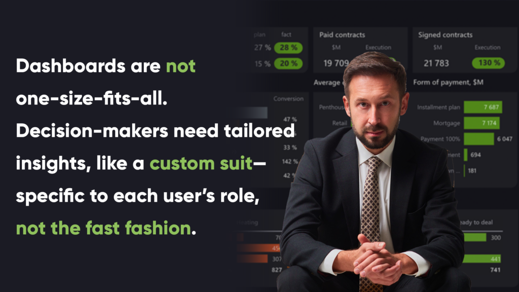
Dashboards are not one-size-fits-all. Decision-makers need tailored insights, like a custom suit—specific to each user’s role, not the fast fashion. At my company, we craft dashboards like bespoke suits that fit each client perfectly. And while AI will continue to evolve, for now, there’s no substitute for human expertise when it comes to delivering dashboards that drive decisions.
By transforming complex data into clear, interactive dashboards, I help businesses visualize key metrics and trends, allowing them to track performance and spot issues early. This enables leaders to make informed decisions, adjust strategies, and drive growth based on accurate, real-time insights.

Why do managers and entrepreneurs need data visualisation skills?
The first step, even before expecting AI to deliver final solutions, is developing data visualization skills. Without understanding the fundamentals, advanced AI tools, like ChatGPT, may provide results that miss the mark. In the world of AI, the ability to interpret and present data effectively remains a crucial skill for making informed and strategic decisions. “Data Visualization with Microsoft Power BI” serves as a solution for building data literacy and becoming a data-driven manager.

Managers and entrepreneurs need data visualization skills because gathering data is only part of the process—presenting it in a clear, impactful way drives real decision-making. They deal with endless reports daily, but few know how to make them visually impactful. From what I see among my clients and businesses in different areas, there’s a lack of understanding about modern data analytic tools’ capabilities and how to set clear objectives. And my latest book is a great help for managers looking for innovative ways to enhance reporting to be able to make sufficient decisions. The best practices inside it teach how to build reports that focus on the right metrics and how to design dashboards that are instantly clear.
Many businesses fail to use modern analytics tools like Power BI, relying instead on outdated methods like Excel and PowerPoint, limiting their ability to automate reporting. By learning to create intuitive, interactive dashboards, managers can make sense of complex data quickly, enhancing their ability to respond to business needs. The book simplifies Power BI, making it as intuitive as PowerPoint for business users, it guides analysts and managers, teaching them how to create effective dashboards without coding.
Coming from 15 years of experience, over 500 created dashboards and 112 companies, the book teaches users to create ergonomic, user-friendly visuals. For managers, it offers clarity on what’s possible, enabling them to ask the right questions and collaborate better with their analytics teams. The result lies in stronger communication, smarter decisions, making managers in fact data-driven leaders.


